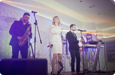
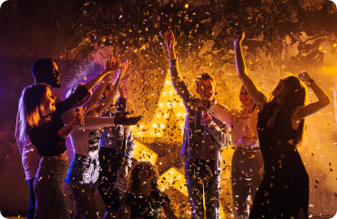
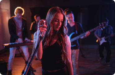
Best Mark My Words

I finally got my new project wrapped up and released into the wild this weekend. It is a new hand-lettering blog, Best Mark My Words. My collaborators and I every week will tackle a singe world, drawing a workdmark geared towards our own taste and preferences. The first and only rule of BMMW is that it is hand drawn — it is colored, inked, and designed solely by hand. That is it. You can talk about it all you want.

I'm positive you will see some well executed pieces. So far I have gotten two people involved whose work I admire very much. Alexander Hemming is my first partner in crime and as soon as he gets settled in Dylan Todd will be joining us as well. I'm positive we will all produce work that go in explores vastly different directions. I can't wait to see what these two come up with.

There will be more people as word gets out and we work out logisitcs better. Please take a look and if you feel so inclined, add it to your reader. I guarantee you will either love it or be appauled.

1.21 Gigawatts

It was only fitting that last night I watched Back to the Future. In honor, I did a little time traveling today however I did not need 1.21 gigawatts, a flux capacitor, a bolt of lightening, Libyans, or Biff Tannen.

One of my new favorite obsessions on the internet is the absolutely stunning model photography of Michael Paul Smith. Michael builds these models himself, roughly based off his hometown of Pittsburgh. These are not off the shelf model kits, these are models he builds from scratch. He pushes himself beyond the definition of model building. He is essentially creating tiny and encompassing world. He paints them, decorates them, and accessorizes them. Everything from tile patterned floors and paintings on the wall, to the chromed counter at a diner. They all have a level of craftsmanship and attention to detail that a designer loves. The lunch counter with fresh bread and advertisements. The old box in the garbage truck. The era advertising on the billboards at the car dealer. I could look at these all day. This work offers tremendous depths to its possible uses to a designer. I threw the cover comp together below in a matter of minutes. Where else would you find such high quality era photography? As a book designer, I would much rather license these images than troll through the stock photo terribleness out there.

Read More

Brooklyn Gutters

I internet-moseyed on over to one of my daily blogs, Uni•Watch. They had a write up mentioning yesterday's post and in the comments there was a collection of beautiful bowling shirts from the Life Archives. I love bowling. I love the history, I love the meteoric rise of its popularity's peak in 50s and its dramatic fall from grace in the late 70s. There is an amazing documentary called A League of Ordinary Gentlemen. It chronicles the woes of the PBA and it's rebranding by three former IBM executives. I loved every single minute of it. I suggest checking it out.

I'm mediocre bowler at best when sober and terrible after a few Alley beers. However, I still bowl whenever I get the chance. It's not as often as I would prefer, because well to be frank, it costs and arm and a leg in Brooklyn or New York. Steph and I try to go when we are in Long Island. Along with my admiration of the game comes my love of the shirts. I have been wearing bowling shirts since high school. I used to buy a lot of new and repros from Daddyo's. Not the tasteless ones, just the simple repros. When I do find a vintage one in good condition it is usually out of my price range or quickly becomes so on eBay.

About 2005 my wife, then girlfriend, moved back to Brooklyn. It was a return of the prodigal daughter. Steph's family all comes from Brooklyn and left in the 60's to greener pastures east. A few remained but for the most part they relocated to Long Island and the surrounding tri-state area. When I was helping her move, she unearthed some vintage clothes that she had inherited from family members. One of these gems is a Hilton bowling shirt from a family member long ago. It is now one of my prized clothing possessions. She gave it to me as a reward/motivation for helping her move.

Read More

Justifiable Fisticuffs

This weekend was a rather eventful one. I threw my wife a surprise birthday party at our humble abode in Brooklyn (I’m gonna write a blog post bout the design of it this week...yes, it was its own brand). It was great seeing all our friends and she was absolutely surprised. I got her a great Mary Blair book from the recent exhibition of her work in Japan. It is a beautiful book, and I never knew it existed. Thanks to twitter and the interwebs for pointing it out.

After all this was said and done, Steph said my holiday gift had arrived. She was high on her party and she really wanted to give it to me. I agreed. Hah. She pulled out a gem of a gift. Something that made my other gifts from her jealous. She does some major legwork with the gifts.

She got me a hardcover trade of the first Dick Tracy story arc reprint. I want to take a look at the amazing design of this book. The cover of this books makes me cry tears of offset goodness, and the whole thing is a personification of hard-boiled detective goodness.

Read More

Tattoos: Sailor's Engraving

Tattoos have been around since man figured out how to do. Basically since before we were a twinkle in the eye of a great-great-great-great, men and woman were permanently marking themselves.

I got my first tattoo a long time ago, a decade or so. I have since gone about covering a large percentage of my body. Most of the tattoos I have do come with alot of copy. My arms read like a book, and my wife is constantly busting my chops about it (despite the fact she did a few of them, including the one above).

I’ve seen a lot of blogs and books talking about typography in tattoos. I believe there are even several flickr sites devoted exclusively to the topic. These are not new ideas people. They are completely different things. There is as much typography in tattoos as there is in a hand-drawn punk fliers. Zilch. Just cause it has letters it is not typography. It is beautiful design, it is amazing art. It is not typography.

To quote a smarter man than myself, “Typographers set copy 8 hours a day and are in a union.” That is about how much typography there is in tattoos. Now if people are passionate about letters, and want to get certain ones because they have an emotional connection to them, then yes. Please, get it done, the more tattoos the merrier. I even have a want for a some certain characters myself, but I will maintain it is not typography. Letters have been used in tattooing long before there was fontographer.

Read More

About Me

I like to think I am a tough shot to call, a hard nut to crack...a renaissance man, in the parlance of the times. I think men should wear hats, dress nicely, enjoy beautiful things, have a working knowledge of cocktails, appreciate letters for their functional beauty & be handy with cutlery. I am a designer, but I'm not sure what that means either. Let's just say I'll betcha' I can make it better. If you are interested in seeing more work, setting the record straight, or merely wanna say hi, drop me an email.

Recent Posts